Audit
I identified pain points in layout, navigation structure, and content overload.
CASE FILE / MOBILE
A mobile UX case study focused on helping students navigate campus life, access essential tools faster, and feel less lost inside a fragmented digital system.
pulse_case_study.exe
01 / OVERVIEW
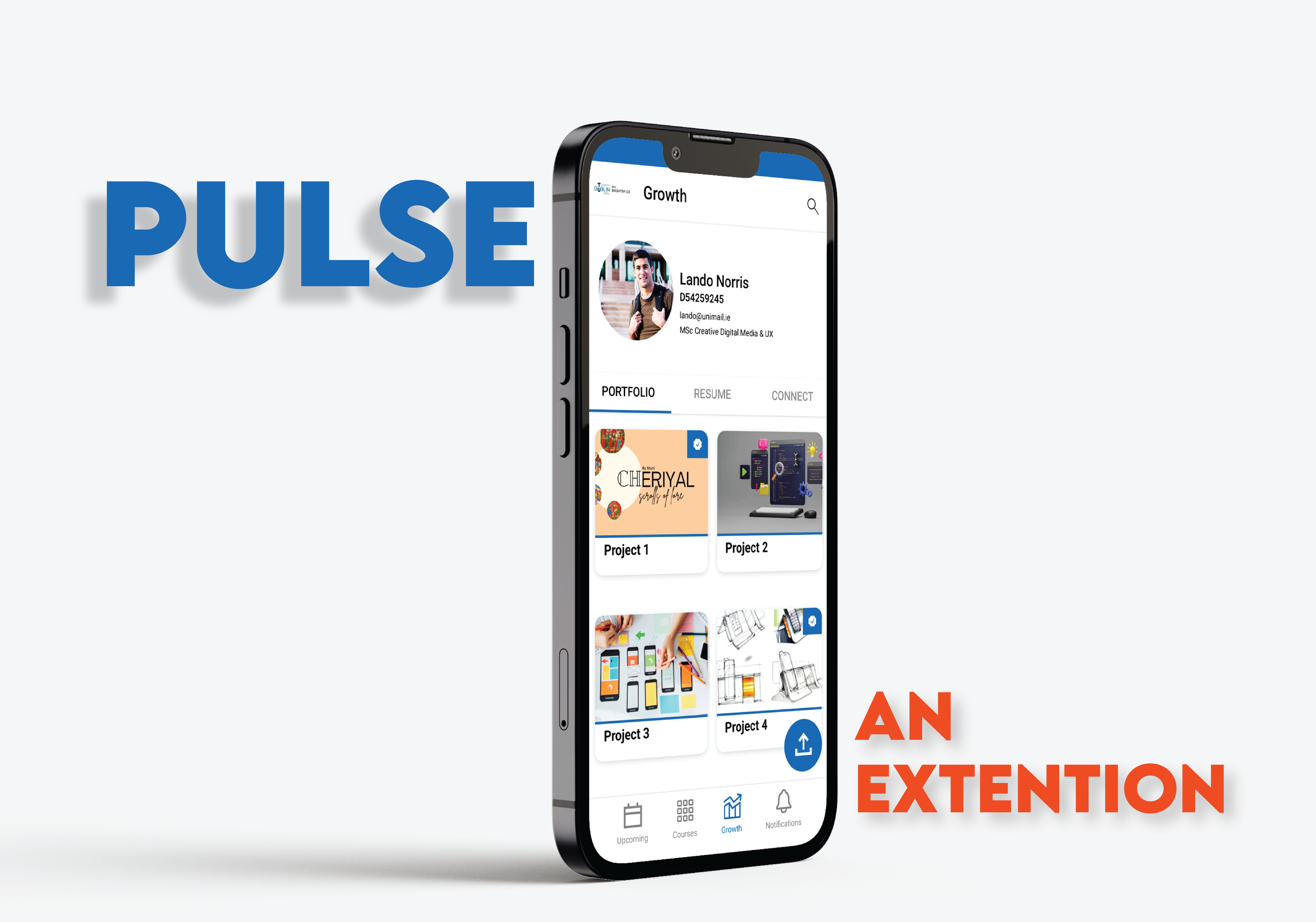
Enhance Brightspace Pulse to support not only organization, but also project showcasing and student networking.
While the app is effective for tracking coursework and deadlines, it does not provide ways for students to display their work or connect with peers and collaborators.
Introducing portfolio and networking features would create a more well-rounded platform that supports both academic management and personal growth.
02 / CHALLENGE
Students often need quick access to class info, announcements, schedules, and support tools, but many education platforms bury these actions under cluttered layouts and weak hierarchy.
The challenge was to create a system that felt simple at first glance while still supporting a wide range of student needs.
CORE UX ISSUE
Too much friction between intention and action. Students knew what they wanted to do, but the interface did not help them get there quickly.
03 / PROCESS
I identified pain points in layout, navigation structure, and content overload.
I mapped the most important tasks students would want to complete quickly.
I designed low-fidelity structures to test clarity, grouping, and hierarchy.
I developed a cleaner UI direction with stronger contrast, rhythm, and emphasis.
04 / SOLUTION
Important actions and content are surfaced faster through spacing, grouping, and stronger visual priority.
Core student tasks are easier to reach through simplified structure and more intuitive paths.
The interface feels calmer and easier to scan, reducing cognitive overload.
05 / GALLERY
06 / PLAYTEST
Experience the final design through an interactive prototype, or dive deeper into the thinking behind it. The report outlines the full process, decisions, and iterations that shaped the outcome.
07 / OUTCOME
This project helped sharpen my ability to combine usability thinking with a stronger visual point of view. It reinforced the value of clarity, hierarchy, and designing around what users need most in high-frequency contexts.
RESULT
A more focused, student-friendly product concept that feels simpler, sharper, and more confident from first glance to final interaction.